
Friday, 28 February 2014
Today was my first day of Typographic Skills class. This class content many students. It's the biggest class I've ever take. It's consist like 15-ish students. So, for today, we only have a presentation about brief history of typography. So, this was what I got from the presentation:
A BRIEF HISTORY OF TYPE
-
Type
has existed for about 550 years.
-
The
stories of type begin with the beginning of mankind and civilization and are
rooted in the life of the cavemen.
-
It
was the developing needs and habits of the cavemen, which led civilization on a
path toward the evolution of the alphabet, and subsequently the invention of
type, and printing.
SOUNDS TO SYMBOLS
-
Early
man communicated purely with sound.
-
Stones,
history and other information couldn’t be passed on from generation to
generation in a permanent way only by direct word of mouth.
-
The
earliest attempts to record stories and ideas were through cave drawings, the
first know dated around 25,000 B.C.
-
The
caveman drawings, or pictographs,
were very simple representations of people, places and things and more
permanent than sounds.
-
Around
3,000 B.C, the Sumerians developed cuneiforms; a system of writing that
consisted of wedge-shaped forms carved into clay tablets and other hand
surfaces.

-
Cuneiforms were one of the first systems of writing
to read left to right.
-
There
was a need for more symbols to represent ideas and other concept in addition to
just “things”. This led to the new development of ideograms or symbols representing ideas and actions.

-
Ideograms
were more difficult for
the masses to understand, as it was not purely representational but more
symbolic in nature.
-
Spoken
and written language had become very different from each other, requiring the
learning of two unrelated system of communication.
-
As
society became more complex, the existing system did not meet its increasing
needs and was no longer satisfactory.
-
This
need subsequently le to the development of letter symbols which when put
together represented words.
-
The
Phoenicians, a society of
traders and skilled craftsmen on the Mediterranean Eastern Coast, took written
language a giant step ahead from the pictograms and ideograms.
-
Around
1,000 B.C. they developed twenty-two symbols representing written sound to
imitate the unspoken words, eliminating the memorization of hundreds of unrelated
symbols
-
This
unique concept was the first attempt to connect the written language with the
spoken word; we now call this phonetics.
-
Around
800 B.C. the Greeks embraced the Phoenician invention and took it one step
further by adding vowels and naming the symbols.
-
They
also employed boustrophedon (meaning
“as the ax plows”) a system where one reach from left to right at one line, and
right to left on the next.
-
The
Roman began joining and slanting the letters in harmony with the natural motion
of the hand in their attempt to write more quickly and efficiently.
-
The
Roman also added ascenders and descenders as well as condensed forms of the
alphabet to conserve valuable space.
 |
| Typography anatomy |
 |
| Roman letter |
-
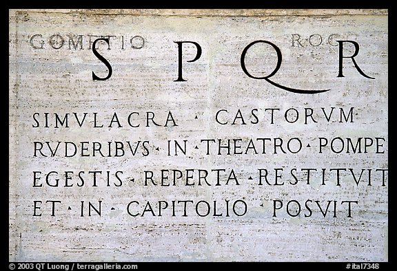
One
of the most important contributions to early writing by the Roman was Trajan’s
column dated 114 A.D. it showcases one of the most beautiful and best known
examples of Roman letterforms.
 |
| Trajan's column |
GUTTENBERG AND MOVABLE TYPE
-
Until
the fifteenth century all books were hand-copied by scribes, as exemplified by
the many breathtakingly beautiful and exquisitely written and illustrated
manuscripts that were created for religious purposes in monasteries.
-
In
1448, that all changed with the birth of printing.
-
Johannes
Guttenberg, a goldsmith from Mainz, Germany is credited with the invention of
movable type. There is some controversies as some credits Lautens Coster of
Haarlem in the Netherlands with its invention.
-
Guttenberg
accomplished this by carving the characters of alphabet it relief onto metal
punches which were then driven into other pieces of metal called matrices.
-
Molten
metal was then poured into these matrices, making the actual type that was
identical to the original relief punches.
-
The
type was then fit into printing presses that were capable of printing multiple
pages in a very short time. This was called letterpress
printing and had their distinctive characteristic of each character
making a slight impression on the paper giving it a rich tactile quality.
-
Gutenberg’s
first typeface was in the style of the heavy blackletter popular in Germany at
that time, and contained three hundred characters including ligatures and
abbreviations.
-
As
the popularity of printing became more widespread, different typestyles emerged
based on popular handwriting styles of that time including those favored by
Italian humanist scholars.
-
Nicholas Jenson and Aldus
Manutius were two printers of the time who designed typestyles that were
influential and inspirational even to this day.
-
Gutenberg
then went on to print the Bible, the first book printed from movable type.
-
It
was no longer necessary for scribes to spend months and years (and lifetimes,
actually hand-copying books).
-
This
historical milestone brought forth
many changes, such as improvements in printing, presses, papers, and inks.
-
It
also inspired many others to design typefaces to make use of this
transformational invention.
-
The
sixteenth century brought us the beautiful proportions of the work of Claude Garamond and Robert Granjon.
-
In
the next hundred years, the balanced designs and readable typestyles of William Caslon emerged.
-
Giambattista Bodoni and Firmin
Didot were tremendously influential in the eighteenth century with their
elegant and graceful design.
-
The
nineteenth century gave way to the old style characteristics of William Morris’s work.
-
The
twentieth century brought us many designs inspired by the geometric Bauhaus style.
-
Many
thousands of typeface styles available to us today are in large part due to the
originality, artistry, and craftsmanship of five centuries of talented printers
and designers, only a handful of which are highlighted here.
 |
| Metal movable type |
 |
| Guttenberg letters of lead |
 |
| Guttenberg press |
PHOTOTYPE
-
The
groundbreaking improvements in typesetting equipment were achieved in the late
nineteenth and early twentieth century.
-
In
addition to its lack of speed and reliability, one of the primary limitations
of metal type composition as it is referred to, was the inability to justify
type automatically that is, without the manual insertion of metal spaces
between the letters.
-
The Linotype
machine invented by Ottmar
Mergenthaler in the 1880s as well as other typesetters that followed,
including one from Monotype sped up the printing process immensely including
justification and finally eliminated the need to set type by hand one letter at
a time.
 |
| Linotype machine |
-
The
greatly increased speed had a major effect on newspapers by allowing them to
extend their deadlines to print late breaking news.
-
This
typesetting changed went hand-in-hand with advancements in the printing
industry such as offset lithography, a photographic process that gradually
replace letterpress printing.
-
Technology
took a huge leap ahead in the mid 1950s with the development of
phototypesetting.
-
Several
companies the most prominent being Mergenthaler and intertype, developed and
improved a photographic process of setting type whereby typefaces were made
into negatives through which light was focused onto photosensitive paper,
producing an image of the type.
-
The
improvements over hot metal typesetting were qualitative as well as
quantitative.
-
Typesetting
could now be done electronically rather than mechanically, sorting over 500
characters per second compared to perhaps 5 or 6 previously and the equipment
took up much less space.
-
Images
became a sharp and crisp corrections could be made electronically, and most
importantly there was now complete flexibility with regard to intermixing
styles weights and sizes letter spacing and kerning; line spacing and word
spacing; hyphenation and justification; overlapping and other photographic
space effects as well.
-
The
sudden elimination of so many restrictions in the typesetting process had a
major effect on typography and typographic design.
HERB LUBALIN
-
One
of the most prominent figures in typography and typographic design in the
sixties and seventies was Herb Lubalin, a New York design.
-
His
groundbreaking and adventuresome use of type, particularly in publication
U&lc (designed and edited by Lubalin and published by International
Typeface Corporation) influenced designers around the globe.

-
His
work incorporated tight letter spacing and line spacing, extreme kerning with
acute attention of every typographic detail, and the overall use of type and
innovative new typefaces in ways never before seen.
-
He
also handled type in an illustrative way seldom done before either by employing
typographic forms as graphic elements of the design or by creating typographic
puns.
-
The
right types at the expense of readability were a reaction to the restrictions
of hot-metal typesetting that preceded them.
-
This
style has its critics and admirers today, but it is important to understand how
and why it came about in order to appreciate its tremendous importance and
influence of the evolutional type and typographic design.
 |
| His works |
 |
| He could express a "bad thing" (for example Go To Hell is a bad thing right?) with a good way. So, this bad thing is like invisible. |
INTO THE DIGITAL AGE
-
Digital
typesetting method took hold in the 1980s.
-
Because
it was so expensive and nee, only professional typographers in type shops
adapted this electronic method.
-
The
new digital typesetters were capable of composing type and integrating photos
and artwork and layout at one workstation.
-
Digital
color separation and retouching stripping and plate-making were to follow
shortly.
-
At
this point, typesetting was still in the capable hands of professionals who
spent many years learning the craft and trade of typography.
-
In
1985, Macintosh introduced its first computer.
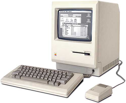
-
It
was the first affordable “desktop computer” developed by Apple founder under
the leadership of Steve Jobs.
-
Other
manufactures, led by IBM were developing version of their own which came to be
known as personal computer or PCs.
-
PCs
had different operating systems than Macs, but the same affordability and
focus.
-
Now
it was possible for virtually anyone to set type on the computer as desktop
publishing blazed the path toward desktop typography.
-
At
the same time, page-layout applications such as Adobe PageMaker and
QuarkXPress, as well as the more illustration-oriented program such as Adobe
Illustrator and Aldus Freehand, were being developed.
-
Simultaneously,
companies and foundries such as International Typeface Corporation (ITC),
Adobe, Linotype, Compugraphics, and Berthold shifted their focus to developing
digital versions of their existing typeface libraries, as well as releasing new
and different designs.
-
Smaller,
more specialized foundries such as FontBureau, Émigré, T-26, and FontShop began
to emerge an introduced some very innovative and cutting edge type designs.
-
The
introduction of type design programs such as Letraset, FontStudio, Macromedia
Fontgrapher, and Ikarus-M afforded the ability to created fonts to anyone who
wanted to.
-
These
developments led to the democratization of type design, and contributed to the
many thousands of fonts commercially available today.
-
The
quality of these typefaces ranged from very high end to extremely poor, leaving
the daunting task of deciphering “which was which” up to the end user.
-
Graphic
design production methods were changing in dramatic ways as well.
-
Paste-ups
and mechanicals (the manual creation of camera-ready artwork using paper proofs
and wax or rubber cement) were being replaced by digital page makeup, which was
cheaper, faster and much more flexible.
-
Type
no longer needed to be sent out to expensive type shops and instead was being
set by graphic designers and productions artists, as well as administrative
assistants.
-
Setting
good typography is an art and craft that in the past took many years to learn
and required highly skilled professionals who devoted their careers to that
end.
-
Today,
however, most of those working with typography have little education in type,
including with few exceptions, most designers (Although some of the better
design schools are just beginning to address this important subject).
-
The
unfortunate result of this situation has been the proliferation of poor
typography.
-
The
computer in just a tool it is a means to an end, not an end itself.
-
Many
designers and production artists are not versed in the factors that contribute
to the creation of fine typography and are not aware of a familiar with the
features in their page-layout programs that can achieve this.
-
With
practice, however, you will acquire the eye necessary to see type as a
professional does, as well as the ability and motivation to create it.
Thanks for taking the time to discuss this, I feel strongly about it and love learning more on this topic.
ReplyDeleteΦΩΤΟΤΥΠΙΚΑ