Ohya! I forgot to introduce my group. We are NOIR! The members are Me, Yasmin, Marilda, and Damaz.
So, our product is Men's and Women's Grooming Set. The next thing to do is..
List up the products
We have some list of products for the grooming set
Women:
- Soap
- Nail clipper
- Comb
- Parfume
- Tweezer
- Bobby pin
- Hair tie
- Fan? (I'm not sure that's the english of Kipas?)
- Oil paper
- Nail file
- Mirror
- Hairnet
- Hand cream
- Lip balm
Men
- Comb
- Deodorant
- Bow-tie
- Belt
- Pomade
- Suspender
- Razor
- Shaving cream
- Pen
- Lighter
- Mirror
red is the one that has been chosen
Deciding the name of our product
We picked up the names from French language because it is the place of fashion. And we picked Noir that's identical to the Art Deco era which came from French.
- Grooming: Lepansage
- Kit: Trousse, Vétir
- Prepare: Préparer
- Easy: Facile
- Urgent: Impérieux
- Beauty: Beau
- Makeup:
- Neat: Ingénieux, Soigné
- Klimis: Lisse
- All: Tout
- Vintage: De cru
- Elit: Élite
- Person: Personne
- Guide: Manuel
- Out: Dehors
- Shine: Éclat
- Glamour: Charme
- City: Ville
- Fine: Délicat, Délié
- Care: Soins
- Perfect: Parfait
- Era: Ére
Logo sketching
 |
| Adia's |
 |
| Adia's |
 |
| Adia's |
 |
| Adia's |
 |
| Adia's |
 |
| Damaz's |
 |
| Damaz's |
 |
| Damaz's |
 |
| Yasmin's |
 |
| Yasmin's |
Because the logo is still not fit in our concept, we decided to made another one. Inspired by Queen and King poker card:
We started to make the digital version of it!
Digitalised and the Typeface
 |
| This is our first logo options |
 |
| Options of typeface |
 |
| Finally we chose 3 of the typefaces. And we had a polling. 5 of our friends chose the left one, 4 the middle one. But our group chose the last one because we think it has a universal target market. Boys and girls could accept this. The first one we didn't really sure. It doesn't convince us. Because we think that it only fin on the girls and not straight forward. The last one is more simple and straight forward. The middle one isn't really elegant because of its leg (is it right?). |
 |
| Working on the man! |
 |
| This one is the best from others. |
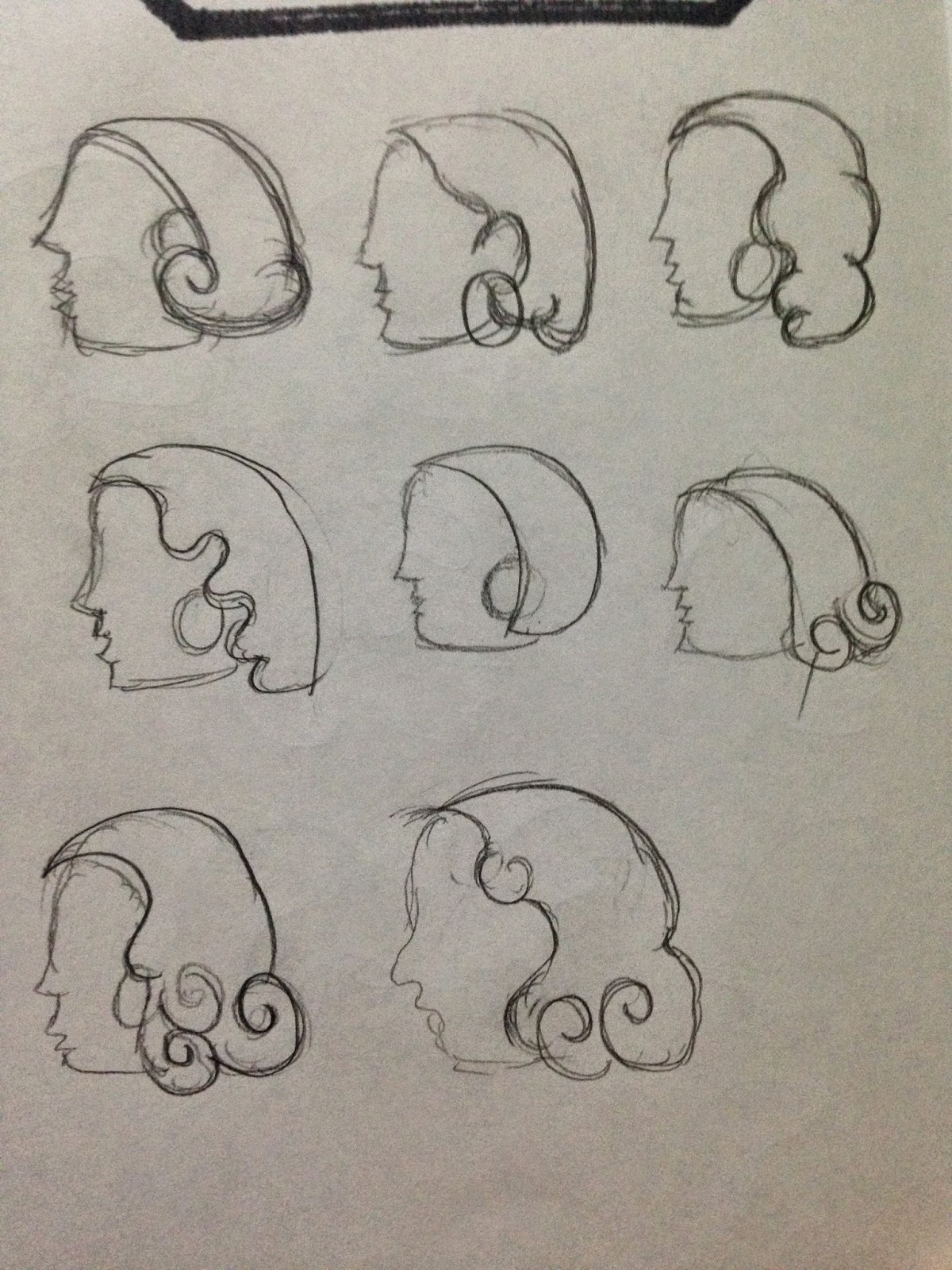
And for the woman, we started to sketch some ideas and styles:
Then we digitalised it!
Next, we combined the man and the woman!
We feel that this logo is not straight forward and too complicated. Many elements shown on this logo. And looks like not elegant. Whereas our aim is to make an elegant logo. Then we reduced some elements there and make it simpler :-)
 |
| We combined every thing (logogram and typeface) and adjust the kerning and leading :-) |
 |
| Finally.. Done with our logo :-) |