Tuesday, 7 January 2014
I've done my Essay!! YE-HA! So, this is my essay:
ESSAY
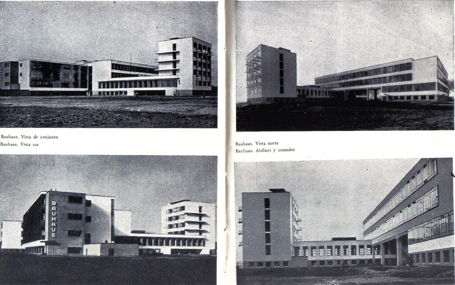
"The New York School" movement is the movement that comes from America. The background of this movement is European Word War 2. Because of the war, many European people moved to America, including the graphic designer. When NAZI closed school of Bauhaus in 1933, the Bauhaus' artists also moved to America built the new school of Bauhaus in Chicago, 1970 (Gumay, A 2013, peers.comm, 19 Nov.). "The New York School" movement was started from 1940s until 1970. Started with Paul Rand's Direction Magazine's cover until international typeface corporation begins (Lubalin and Carnase, Avant Grade typeface) (Meggs & Purvis 1998, p.354-355).
The New York School movement was also the era of editorial design, advertising, corporate identity, and American typographic expressionism.
The pioneers of "The New York School" were Paul Rand, Bill Bernbach, Alvin Lustig, Alex Steinweiss, Bradbury Thompson, Saul Bass, George Tscherny, Thomas H. Geismar, Ivan Chermayeff, Robert Brownjohn, Alvin Eisman, Norman Ives, Cipe Pineles, Leo Leonni, Otto Storch, Henry Wolf, Peter Palazzo, Dugald Stermer, Bea Feitler Mike Salisbury, Bob Gage, Charlie Piccirillo, Helmut Krone, Jim Brown, Bill Taupin, Bert Steinhauser, Gene Federico, Don Egensteiner, Jogn Alcorn, Herb Lubalin, and George Lois (Meggs & Purvis 1998, p.374-398).
One of my favourite "The New York School" pioneers is Saul Bass (1919-1996). Saul Bass moved from Los Angles to California in 1950. Then he opened a design studio in 1952 and got design jobs from motion pictures. He was mainly inspired by Paul Rand. Paul Rand was using asymmetrical balance during 1940s, and inspired Bass as an artist/designer. The different between Bass' and Rand's design are Rand was using complex contrasts of shape, colour, and texture, Bass was making his design into a single dominant image (Meggs & Purvis 1998, p.378-379).
Saul Bass has many masterpieces. He reduced complex things into a simple things. He made some movie posters such as The Man with the Golden Arm, 1955, Exodus, West Side Story, Anatomy of a Murderer, and Star Wars. He also made the first moving credit sequence in The Man with the Golden Arm movie with Frank Sinarta's song. and what I love about his The Man with the Golden Arm movie poster and sequence are the simpleness and to-the-point. The image is not too detail, he didn't use that many colours and he used simple shapes. Simplification makes the audience received the information faster. When I think about Saul Bass, I always remember this statement: "Less is More" and yes I'd agree! I also likes his Anatomy of a Murderer poster. Without drawing a realistic picture and actual colour of human and only used simple shape that built together as human, people could easily recognised that picture is human. And I like the way he separated the human's body. It's just a representative of the movie. (The Saul Bass Poster Archive, 2013)
Saul Bass was not only designing the movie posters. Saul Bass by driveinmedia.com (2013) describes logo that he made. He took 10 years break from Hollywood in the late 1970s instead returning to traditional commercial graphic design. Some logo that Saul Bass made are for Girl Scouts, Kleenex, Dixie, AT&T, United Airlines, Quaker, and 1984 Olympic Games.
Saul Bass inspired a lot of things. I think, the category that highly influenced by Saul Bass is movie. From the movie category, In chrissfabbri's (2009) video, Saul Bass' style inspired opening credit of Kiss Kiss Bang Bang and in The Concise Statement's (2008) video, Catch Me If You Can.
For me, Saul Bass' works are so easily recognised and people could see "That's so Saul Bass" because of the simple design. His typefaces are also unique and difference with each other. I think, his dedication in graphic design is so influencing. People inspired to use simplification.
New York School movement also revolutionised editorial design because on 1940's, only few magazine were well designed. Three of them are Fortune, Vogue, and Harper's Bazaar. Fortune magazine were art directed by Will Burtin and Leo Leoni, Vogue by Dr. Agha, and Harper's Bazaar by Alexey Brodovitch. (Meggs & Purvis 1998, p.383) In my point of view, why those magazine were well designed is maybe because of the layout is clear. They used a consistent typeface and really careful with the white space and margin. I really really love Alexey Brodovitch design in Harpeer's Bazaar. His layout is so unique. The model flow and pose were inspired Brodovitch and he used it as the layout. He also good at controlling the white space so there still "enough space to breath". Not too full but also not too empty. Nowdays, the neatness of layout and space were getting better and better.
The New York School also has an era called "American typographic expressionism". Three of the pioneer of this era were Gene Federico, Don Egensteiner, and Herb Luballin. Gene Federico made an advertisement for Woman's Day in 1953. In that advertisement was written "go out" with Futura typeface and made two of its Os become the bicycle's wheel. And I like it because no need to make the bicycle separate with the text. Just using the two Os. Don Egensteiner made an advertisement for Young and Rubicam Advertising in 1960. I really love with his work here because it really represent the tonnage. Pressing another sentences. And I can feel the sense of tonnage. I also love some of Herb Lubalin works. Those are typo gram from a Stettler typeface announcement poster in 1965, his and Tom Carnase's proposed magazine logo in 1968, proposed New York City logo in 1966, and Ice Capades logo in 1967.
Herb Lubalin works were so expressive. Take a look to the "Marriage" word that he made in typo gram from a Stettler typeface announcement poster. In my opinion, He made the Rs flipped to show that they are kissing each other and his options in typeface looks serious and sacred. The next is "Mother & Child's logo by Luballin and Carnase. So creative but simple. What I noticed is that they used the "&" become the baby and the "O" become the mother's stomach or togetherness. So I can make the conclusion that "O" and "&" become a pregnant mother. Based on Lubalin and Carnase's work on proposed magazine logo in 1968, I can feel the togetherness and connection between mother and child. The word "NY,NY" in 1966 represent a city with many buildings. Why I said that? Because I think the way he made the text looks like square and rigid is that they represent the buildings. (Meggs & Purvis 1998, p. 392-293)
Corporate identity also has the influence of the New York School era. For example, MTV's logo. MTV's logo was the first customised logo. So you could change inside MTV logo based on the theme of the music. mtv-rock-the-cradle by garagespin.com describes for example, MTV is showing a rock music video, so the logo's fill expressed the sense of rock. For me, rock music represents freedom, young people or teenager, boyish, and hard. So it just fit with this logo. image3xl by http://images.asos-media.com describes another example, on christmas time, MTV's logo changed into christmas themed. So we could feel the sense of it. The image for the logo's filling is also looks fun and it couldn't be boring because it could changed. I think MTV's target market is teenager. As a teenager, I don't get bored with its logo because it could be change. I think MTV logo is a good inspiration in New York School's era. My opinion, it inspired the first moving logo (or animated logo), CBS' logo. And I think CBS' logo was inspired by Saul Bass' moving title sequence. The benefit of MTV logo is fit in every situation because it could change based on the theme.
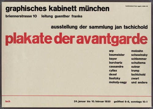
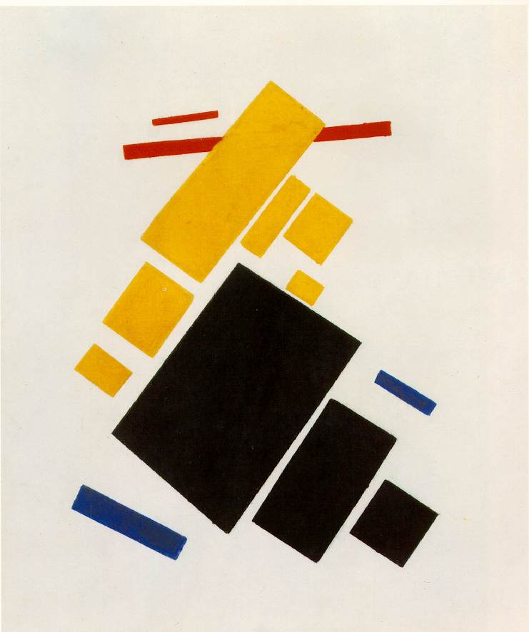
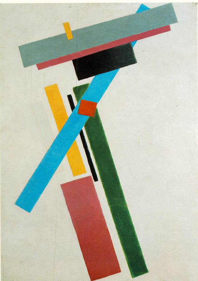
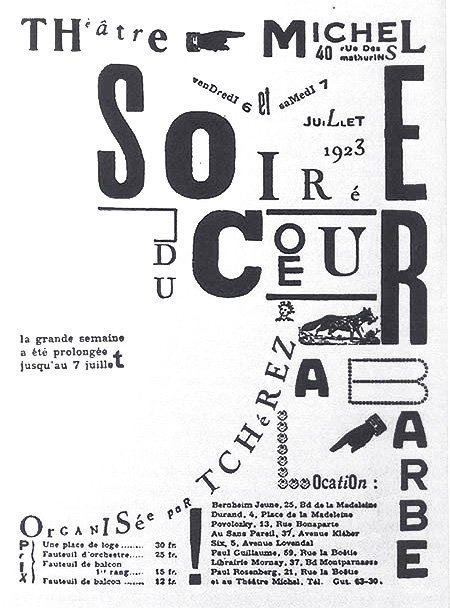
The New York School was influenced by Russian Constructivism movement. Both of the movement are working on mass communication, for example magazine. They were focusing in neatness in layout and how to communicate in fast way. The arti st that makes a change is El Lissitzky. He became the lecturer in School of Bauhaus. So when the School of Bauhaus' artists were moving to America because of the war, they made a significant change there. And there, was born the New York School movement.(Gumay, A 2013, peers.comm, 17 Dec.)
Until now, I think we still can feel the influence of The New York School movement. Today's graphic designer also use the principal and way of thinking like in the New York School era. For example Michael Biuret's work in MAD's logo. mad_logo1 by objectifiedfilm.com describes some of MAD's logo. And it looks like you can customised the logo based on the situation, condition or theme. I think the logo's concept is inspired by the MTV's logo. The idea of customisable logo. And he used the simplification in its typeface. Only by using circle and rectangle as its typeface. And this simplification appears in the New York School era.
"Jurrasic Park" and "The Lost World" book cover that made by Chipp Kid it remind's me on Bill Bernbach's work with Bob Gage as the art director and Judy Protas as the writers on Ohrbach's advertisement in 1958. On that advertisement, Bill Bernbach made the space is still good looking and neat whereas the image is almost full. He could control the white space. I think what makes it looks nice is the typeface. He used a light or thin typeface. Imagine if he uses bold typeface I think it will be a bad decision and will "hurts your eyes". And the hierarchy also flows well on Bill Bernbach's work. When I see that advertisement, First thing that I see is the cat, then the "Ohrbach"'s word, then the word on the left side of the cat, the last is the description words. Same case with this "The Lost World" book cover. Chip Kidd uses full image of Tyrannosaurus Rex's head but we still comfort with it whereas the image is almost full. The hierarchy is also good. And Chip Kidd was only using 3 colours: red, white, and black, but he could make the book cover still looks interesting. The red colour is very strong, so we could forget that red word (the author of the book). He also used simplification on the T-rex's image. By not using the real T-rex image and only using simple silhouette of the T-rex, we could knows it is the image of T-rex faster. And remembering me on the word "less is more". (Henderson 2012)
The logo of University of The Art Helsinki also got the influenced of the New York School movement especially from George Tscherny. George Tscherny made the exhibition catalogue cover in 1961, José de Rivera. George Tscherny is also the pioneer of the New York School movement. His works looks like a twisted and crushed paper. It's so unique, and has the characteristic. People can easily know it's George Tscherny's style. 5291275be7496 by pinthemall.com shows the logo and some stationaries of University of The Art Helsinki. When I saw the picture of University of The Art Helsinki logo, I also remembered Tscherny's work.
I also found the iBallet logo. It directly reminds me about Herb Lubalin's work in American typographic expressionism. The letter "i" and "B" on the iBallet logo shows us the dancing ballerina who's spinning her body by using one leg. The "i"'s dot is for the head, and the letter "B" is for her body including the hands and the leg. The choice of the typeface also fit with the word. It shows a supple flow and free. I think when we hear the word ballet, free and a supple flow are the fit words that describes ballet. (Bobrov 2013)
Based on what I've learned in the New York School era, I found some characteristic of this movement. The New York School era uses a simplification in things so the information was more effective for people. And the works were to the point and not too much. Different with Art Nouveau. On that era, most of people uses illuminated manuscript style, and it's so decorative. The New York School movement also neater. For example the magazine's layout was more simple and clean. In this movement, I think the target of every graphic designers were to share the information clearly with less things. And the fittest quote for The New York School movement is "less is more".
In conclusions, the New York School has huge influences on today's graphic design world. We could see it in today's graphic designer style that I've mentioned before. They still got inspired with this era. Some of people's works on the internet are also still influence by this style. This era also has a huge influence in editorial design like magazine and advertisement, especially layout wise. And some other categories that feels the influenced by this movement are mass communication, movies, corporate identity, and signage.











/Art-Abstract-Posters-Texts-(Dutch)-@PS135.jpg)