graphic design - music - photography


The posts are based on researches, the lecturer's materials, and my opinions.
Sorry if I made any kind of mistakes.

Welcome!

Tuesday, 27 May 2014

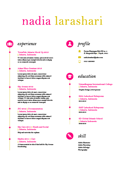
Stationery: Resume

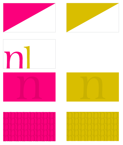
These are some options for the resume (layout + colour)
Comment: It makes the resume look so heavy if using the blocked colour.


This one is more unusual! :-)
Comment: doesn't need to put the profile.


The final decision

Resume's draft:
EXPERIENCE

2014          Wego Competition | Jakarta
                  Concept making competition for promoting Indonesia.
                  Paricipant
2013          Agri Agro Festival | Jakarta
Annual event where direct trade is made possible between farmers and consumers.
Responsibility: Committee of the Youth Corner.
2013          Adam Khoo Seminar | Jakarta
Leading programs to learn about strategies, personal development, wealth creation, and investment.
Participant
2013                   TRAX FM Greenation: Mock Up of Jakarta sponsored by TetraPak | Jakarta
Event held by TRAX FM that utilized recycled paper from TetraPak packaging to make a mock up Jakarta.
Responsibility: designer, cut, and paste.
2012          Sky Avenue | Jakarta
Performing art and market place with participation from more than 15 brands.
Responsibility: Health and Social Committee
2012          Sky Medic | Jakarta
Free medical check up, treatment, medicine, and free groceries.
Responsibility: Health and Social Committee
2012          Hunting On The Trip (HOTT) | Bandung
Photo hunting competition.
Responsibility: Health and Social Committee
2012          Jakarta In Global (JIG) |Jakarta
Jabodetabek high school education competition.
Responsibility: Documentation
2012          Sky Battle | Jakarta
Jabodetabek high school sports competition.
Responsibility: Health and Social Committee
2011          Goes to Sky | Jakarta
An event that held on car free day for promoting Sky Battle 2012. Clothe, poster, and brochure are the promotional tool for introducing Sky Battle 2013.
Responsibility: Health and Social Committee
2011          Sky Care | Jakarta
                  Entertain and help the orphans.
Responsibility: Health and Social Committee
2011          Trip Observation | Purwakarta
Live on the village for 5 days and learn to become the villagers.
                        Responsibility: Mentor
2011-2012 OSIS SMA Labschool Kebayoran | Jakarta
School organization that every member is being in charge for one year and make some events.
Responsibility: Health and Social Committee
2011          Skylite Musical Cast | Jakarta
Annual musical drama holds by SMA Labschool Kebayoran students.
Responsibility: Cast
2010          Trip Observation | Jakarta
Live on the village for 5 days and learn to become the villagers
Participant


EDUCATION

2013-present       Unisadhuguna International College | Jakarta
Graphic Design
2010-2013          Labschool Kebayoran Senior High School | Jakarta
2008-2010          Labschool Kebayoran Junior High School | Jakarta
2002-2008          Global Islamic School Elementary School | Jakarta
2000-2002          Kindergarten at Al-Fauzien | Depok
1999-2000          Playgroup at Kids Sport | Jakarta


SKILL
·      Photography
·      Adobe Illustrator
·      Adobe Photoshop
·      Adobe InDesign
·      Language:
o   Indonesian
o   English

Self Promotion

These are the strategies for people to know me. 

First, I was thinking to make a line sticker. Why? because I think today's era is not far away from the internet. And most of people use their phone everyday. Absolutely for communicating. They communicate thru chat, message, or maybe phone call. The most popular application for chatting is LINE! In my opinion, it is so popular because it provides the stickers that are so expressive and funny. That's why it makes the chat not too cheesy and feel alive! So, I think, if I made that one, people will know me.

The options to make the line sticker are
1. Making the Indonesian character that comes from diverse culture (like Sunda, Java, Batak, Betawi, etc.)
Indonesia has many cultures, and each of them have their own characteristic from the way they speaks and also their faces. 
Threat
I am not really good on drawing. It made me not confident enough to do this. I also have to think about the people's feeling because it's related to human's characteristic. I am afraid it could offend their heart.

2. Due my lack ability on drawing, I was thinking to make it only using typography that express the accent of each culture.
For example Betawi is like "Buset daaah" "Iyeee", and Javanese is like "Monggo", "Rapopo", and anything else. 
Threat:
I also have to think about the people's feeling because it's related to human's characteristic. I am afraid it could offend their heart.

How people will know the sticker?
  • Maybe by sharing it on the social media like facebook, instagram, twitter, and stuffs.
  • Giving the QR code coupon on the coffee shop/gas station every time the people get the bill .
  • Placing the coupon on several places like maybe on the mall's toilet, lift, and waiting places.

Comments:
  • Sticker is not really important
  • Too complicated. I have to think "Does the coffee shop want to cooperate with you" "Does the mall also want it?"


By the reason of that comments, I made the plan B! The plan is making an emergency kit for the graphic designer. The kit are contains: A5 sketch book, post it, pencil, pen, eraser, tipex, folder, mechanical pencil, mechanical pencil refill, and usb.

Comments:
  • More useful
  • Simpler (easy but there are more benefits than the line sticker)

But I want to make it more specific. So I decided to make only the stationery!
post it, pencil, pen, eraser, tipex, folder, mechanical pencil, mechanical pencil refill


Stationery: Letterhead

The letterhead! Before choosing the best one, I used to sketch it first then made it into digital.

Advice: it doesn't have to use the dot under the address. Be consistent!


The chosen one!

Inside the letterhead:
Jakarta, March 19th 2014

LeBoYe Design
Jl. Kemang Selatan 99A
Jakarta 12730, Indonesia

            Dear LeBoYe Design,
My name is Nadia Larashari Shabrina. I am a student from Unisadhuguna International College. I know LeBoYe because of the impressive works for famous brands. And it has been a very famous design firm. Who does not know LeBoYe.
After doing some researches, I really amazed with your project especially the brand identity ones, because branding is not easy and very challenging and also vital. Our first impression depends on the appearance. I am really impressed with tesate brand identity. It looks trusting and elegant. I can feel the traditional feeling in this modern era. LeBoYe can make it flexible. I can still feel the traditional side of tesate, but I also feel the exclusive and modern side of it. It is really impresive. Another LeBoYe’s work that is impresive is the branding of meradelima. It makes me speechless when I see. The red of the logo that looks joyful and complementing the images of fortune and success.
LeBoye makes Indonesian brands looks so exclusive and I think it can be the asset to show that Indonesia made a mark in design world, and it is LeBoYe. It is exactly what I want to do.
I have an assignment for professional practices class. It would be great for me if you can check my portfolio on anytime when you have a leisure time. I am looking forward to hearing the good news and I will follow up on the next one week.

Sincerely,
Nadia Larashari Shabrina


Jakarta, March 19th 2014

Milestone
Grand Panglima Polim Complex
Kav. 88, 2nd & 4th Floor
Jl. Panglima Polim Raya no. 1
Jakarta selatan 12170 – Indonesia

            Dear Milestone,
My name is Nadia Larashari Shabrina. I am a student from Unisadhuguna International College. I know Milestone because of the impressive works for famous brands. And it has been a very famous design agency. Who does not know Milestone.
After doing some researches, I really amazed with your project especially the brand identity ones, because branding is not an easy thing and it challenging and also vital. Our first impression about something is depends on the appearance. The brand identity of Sana Sini restaurant is really impressive. It looks trusting and elegant. Because it located in the Pullman Hotel, Thamrin, the target audience is from class A-B. The design matches with the target audience because it looks clean, simple, and elegant. No need to make it complicated, by making it really simple, Milestone makes their works looks fascinate.
Milestone makes Indonesian brands looks so exclusive and I think it can be the asset to show that Indonesia has a really potential design agency, and it is Milestone. It is exactly what I want to do.
I have an assignment for professional practices class. It would be great for me if you can check my portfolio on anytime when you have a leisure time. I am looking forward to hearing the good news and I will follow up on the next one week.

Sincerely,
Nadia Larashari Shabrina


Jakarta, March 19th 2014

Ms. Nilam P. Moeliono
Menara Jamsostek
Menara Utara Lantai 12A
Jl. Jend. Gatot Soebroto
Jakarta 12710

Dear Ms. Nilam P. Moeliono,
My name is Nadia Larashari Shabrina. I am a student from Unisadhuguna International College. I know Landor because it has been a very famous design house. Who doesn’t know Landor. It has been founded for a long time. And has some design house around the world. Landor definitely has many experiences. I also know Landor from my lecturer, Ms. Uma Paramita.
After doing some researches, I really amazed with your project me especially the rebranding of some companies. Rebranding is not an easy decision. There are only two decisions, whether the company is getting worse or better. Not all of companies can make a success rebranding. But different with Landor. I really like and appreciate the rebranding of Garuda Indonesia. Despite it can show the elegance side of Garuda Indonesia, the important things is Landor makes it trusting. When I see the identity, there is a trust feeling. Landor makes Garuda Indonesia convince the people. And it is really hard to convince people. For me, branding and identity are such interesting riddles to solve. And it’s exactly what I want to do.
Now I still learning and doing some researches to enhance my knowledge. Not only that, searching as many as experiences that I can is my life’s goal.
I have an assignment for professional practices class. It would be great for me if you can check my portfolio on anytime when you have a leisure time. I am looking forward to hearing the good news and I will follow up on the next one week.

Sincerely,
Nadia Larashari Shabrina

Stationery: Envelope

Next, I'll show you the step on making the envelope's design :-)

sketches


Finally, I chose this one :)

Stationery: Business Card

Hi guys, long time no post.

I will show you a process of making the business card! Check it out
mindmap of me

the reason why

sketches


Then, I digitalised the sketches:


I picked some of those sketches. The best one would be selected.

I tried the colour test.


Layout candidates.

Finally I picked this one.

The reason why I chose this is the hi! is really represent me as a friendly and cheerful person. So people will got their first point of view about me if they got this.