I want to tell you guys about my newspaper, by the way sorry for the late update :-p :-p here's my newsletter for WWF. But before that I'll show you the steps:
1. Research some example of newsletter
2. Search the newspaper from advertising agency, fonts foundry, non-government organisation (NGO), financial institution (e.g. Bank, Insurance, etc.), and design company.
and what I got was WWF e-Newsletter
 |
| I chose November E-news: Polar Bears Waiting at the Edge |
3. Make the mood board!
4. Try to make the newsletter
  |
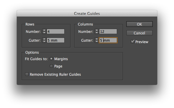
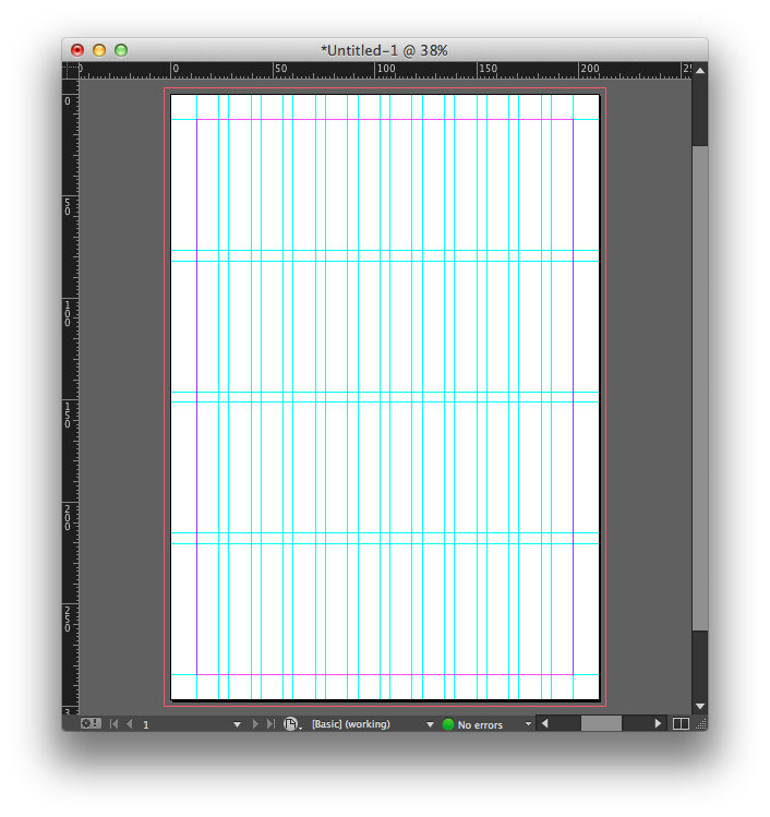
| I made 12 column and 4 rows |
Sir Em gave me some advices:
- On printed newsletter, I don't need to show (print) everything that contains link that we have to click. Printed newsletter doesn't need that. For example like twitter, facebook, and others
- "2 or 3 colours are enough"
- the layout must be consistent
- must contain front and back cover
- minimum 8 pages (including the covers)
 |
| don't forget to change the image size. the image size supposed to be 150-300 pip if you want to print it. |
 |
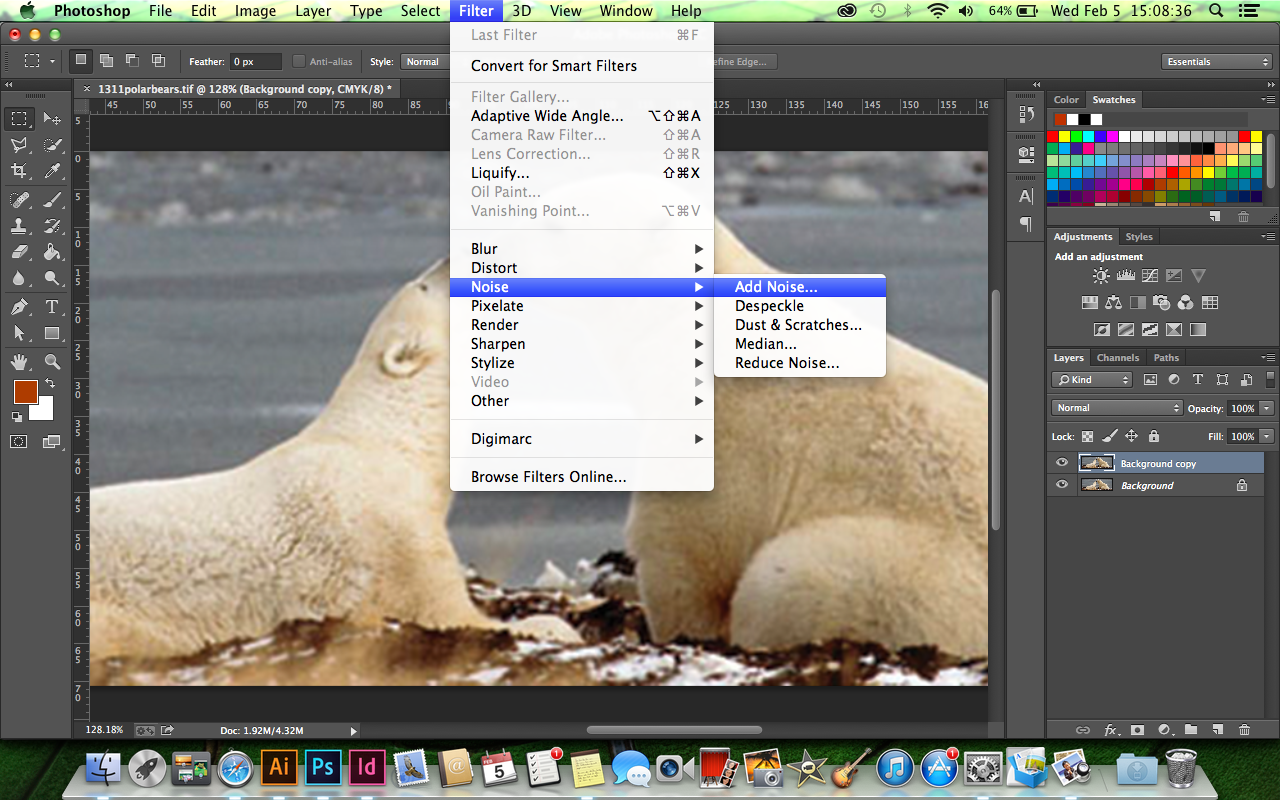
| to reduce the pixelated image, you could add noise by clicking Filter > Noise > Add Noise |
5. Then I made this newsletter

I made the logo by tracing with Adobe Illustrator:


No comments:
Post a Comment