graphic design - music - photography


The posts are based on researches, the lecturer's materials, and my opinions.
Sorry if I made any kind of mistakes.

Welcome!

Friday, 22 November 2013

Exterior (Architecture) and Interior Photography

Monday, 18 November 2013

Today we've a presentation about Exterior (Architecture) and Interior Photography. The tips and the steps for interior photography are:
1. Choosing a room
  • Be careful to select the most interesting portion of the room to photograph cause its impossible to include the entire room in a single shot
  • Be aware of any interesting features in that room that may be of use to the picture
2. Equipment
  • Obviously you should be shooting on a wide angle lens but not a fish eye lens
  • Anything from 12mm or greater on smaller sensor sized DSLR's and 14mm on full frame sensors is fine but the wider the lens, the greater the barrel distortion
  • Shooting on a compact just use the widest angle possible
  • Tripod is often essential and if you really want to do it right you will also need some light/flashes and play with the white balance

BASIC CHOICES (Architecture and interior photography)
1. Content
  • How much scene to show
  • Always in higher perspective (eye level)
  • Overall picture
  • Detail picture
2. Framing The Subject
  • Frame isolates part of large scene
  • Cropping can strengthen a picture, it can be distracting too
  • Decide quickly vertical or horizontal
3. Background
  • It's part of the picture but ease to forget
  • Use background when it contribute something

Screen Printing

Screen printing is a printing technique that uses a woven mesh to support an ink-blocking stencil. The attached stencil form open areas of mesh that transfer ink or other printable materials which can pressed through the mesh as a sharp-edged image onto a substrate. A fill blade or squeegee is moved across the screen stencil, forcing or pumping ink into the mesh openings for transfer by capillary action during the squeegee stroke. Screen printing is also a stencil method of print making in which a design is imposed on a screen of polyester or other fine mesh, with blank areas coated with an impermeable substance, and ink is forced into the mesh openings of the mesh by fill blade or squeegee and onto the printing surface during the squeegee stroke. It is also known as silkscreen, serigraphy, and serigraph printing. You can also have more than one colour printing, for example you could have a stripped printing.

History
  • Screen printing is a form of stencilling that first appeared in a recognisable form in China during the Song Dynasty (960-1279 AD)
  • It was adapted by other Asian countries like Japan, and was furthered by creating newer method
  • Song Taizu, the founder of the Song dynasty
  • Screen printing was largely introduced to Western Europe from Asia sometime in the late 18th century, but didm;t gain large acceptance or use in Europe until silk mesh was more available for trade from the east and a profitable outlet for the medium discovered

Technique
  • A screen is made of a piece mesh stretched over a frame
  • A stencil is formed by blocking off parts of the screen in negative image of the design to be printed
  • That is, the open spaces are where the ink will appear on the substrate 

My article was based on Sir Pongky's (my lecturer) presentation.

Snap! Snap! @ Taman Menteng

Yay! Today (Sat, 16 November 2013) we're going to Taman Menteng. We're asked to take a picture, the theme is "Basic Deisgn Element". So here's my work:

1. Spot
  • A single element or ‘spot’ can be a strong design tool, allowing for control of the viewer’s eye
  • A Single element of design seldom occurs in isolation
  • It draws attention to itself and away from the surrounding area
  • Any small shape can act as a spot

2. Line
  • In contrast to the spot, paths or linear shapes that can be labeled ‘lines’ are another visual tool which can be incorporated into the photographic image
  • Lines give direction by moving the eye across the picture


3. Pattern
  • Multiple spot, lines or shapes can create a pattern


4. Emphasise
  • Camera angle can emphasize subject
  • Altering perspective, framing, depth of field and lighting are just a few ways emphasis may be applied

5. Balance
  • People know when a picture is in balance
  • By referring geometric symmetry 


6. Contrast of Sharpness
  • Sharpness is immediately noticeable
  • People tend to look first at the sharpest area
  • Depth of field affects sharpness
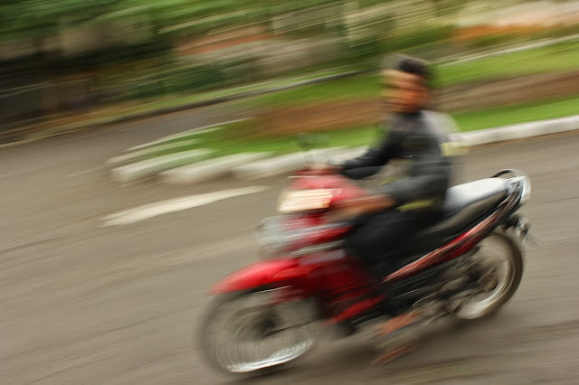
  • Motion can be photographed either blur or sharp


7. Contrast of Light and Dark
  • Contrast light and dark draws a viewer’s eye
  • Contrasts between two objects maybe more apparent in colour rather in B/W


8. Shape
  • A shape is any defined area
  • Object that are close together can be seen as a single shape
  • In a photograph, a shape is always two-dimensional, but tonal changes across an object can give the illusion of depth


Rule of Third
The guideline proposes that an image should be imagined as divided into nine equal parts by two equally-spaced horizontal lines and two equally-spaced vertical lines, and that important compositional elements should be placed along these line or their intersections. Practice this method to have alternative composition on your image.

Hi Adobe Photoshop!

Wednesday, 13 November 2013

Hi guys, after having my stamp done:

We finally had a lesson about Photoshop. Sir Em gave us homework about deleting the background by using photoshop, the steps are:
1. Prepare your image 
2. Select the background by using selection tool on the left. I used the quick selection cause that tool is the fastest and easiest one :) 
3. Inverse it by clicking Select > Inverse and it will become like this:
4. Click Refine Edges to make the outside part of the image looks smoother
5. Inverse it again (so the selected area is the background) to delete the background
6. Click delete button on your keyboard
7. Drag the image for the new background
8. To arrange it behind the bucket just drag the brick and wooden wall layer under the bucket layer (take a look to the layer box)
9. Adjust the size of the background by clicking Command + T

TIPS!

  • Before you try this, DON'T FORGET TO duplicate the background's layer! ;-)

The Unexpected Dali

Tuesday, 12 November 2013

Today we have a class with miss Yacko from UIC Business. She taught  us about Harvard Referencing System. She also asked us to try it.

After that sir Angga gave us a video about Salvador Dali

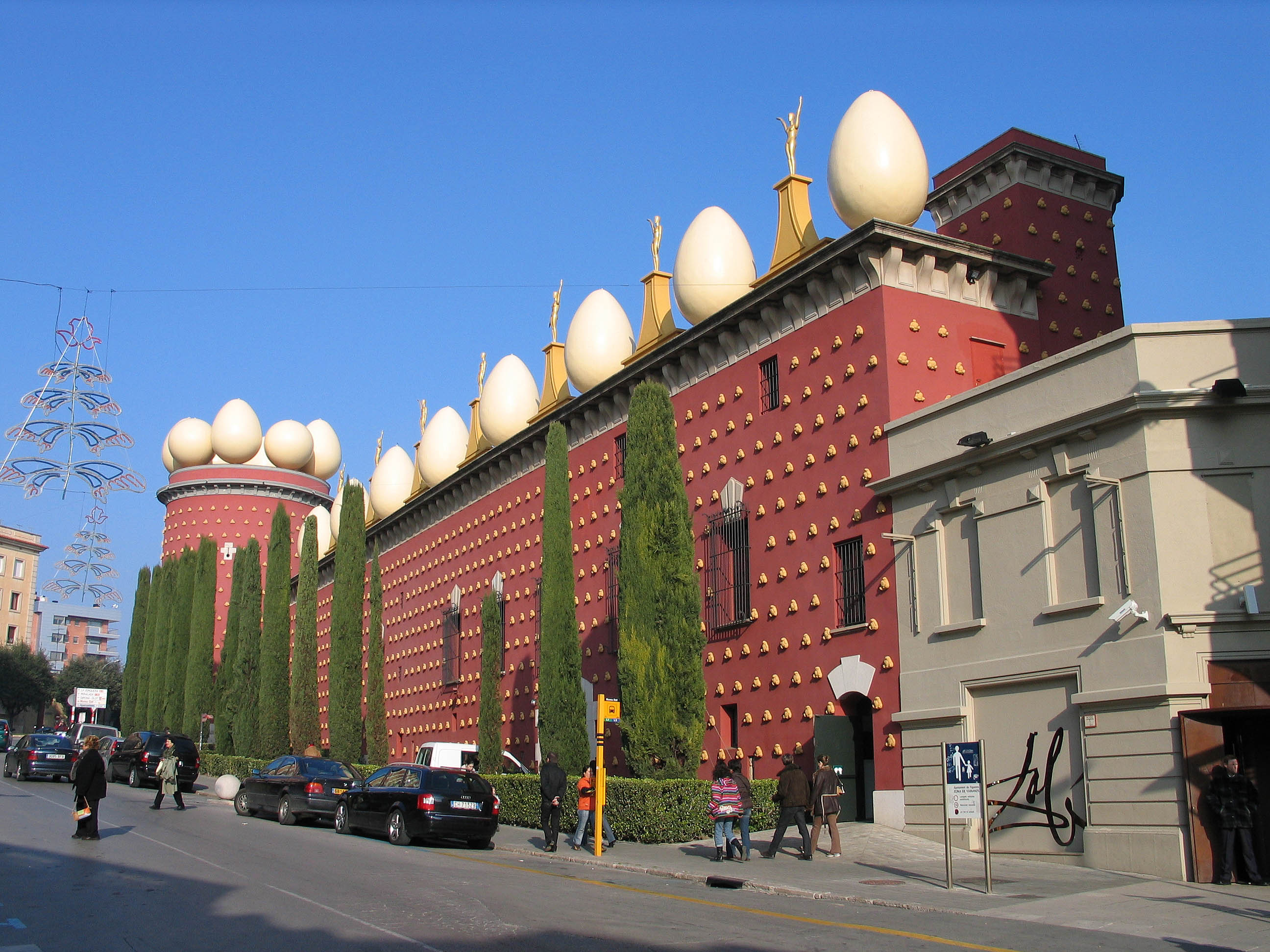
Based on the movie that I've watched i found it that Dali is a different and unusual person. He created a new movement, surrealism. He also inspires many this like movie, comedy, jewellery, music, interior design, fashion, architecture and many more. His works actually based on his life. For example his famous painting and works:
Dali Museum
Lobster Telephone

He made this paint while waiting for his wife


Monday, 11 November 2013

Presentation Day

Monday, November 11th 2013

Today was the presentation day!
We presented our favourite photographer and our works on shutter speed effect & DOF.

Favourite Photographer

Shutter Speed
Fast Shutter Speed
I was experimenting on water splash, then I chose orange. This photo was helped by my sister (she's the one who dropped the orange) :-P - Fast Shutter Speed  
Then I asked her to make it higher and the result is better. The splash effect is more beautiful. - Fast Shutter Speed 
Fast Shutter Speed

Slow Shutter Speed
Lando (my dog) was barking - Slow Shutter Speed
Panning 
Panning
Lando was excited to meet my dad - Panning

Depth of Field
Shallow DOF
Deep DOF 
Shallow DOF
Deep DOF
Shallow DOF
Deep DOF 
Shallow DOF
Deep DOF