graphic design - music - photography


The posts are based on researches, the lecturer's materials, and my opinions.
Sorry if I made any kind of mistakes.

Welcome!

Tuesday, 29 October 2013

Hi, Adobe Illustrator!!

Wednesday, October 23rd 2013

Today we learnt Adobe Illustrator ;-) 
but the learning process for today was less conducive because the light's off and we couldn't go anywhere (fx's restaurants and class in fx were full), so we only had 2hrs of class.

So, what I've learned from today were..

L1: Basic Shapes
I've learnt how to make an elips, square, star, etc.

first, choose the Rectangle Tools on the left side, and hold so it appears some choices of shape that you want to choose.

for the Rounded Rectangle Tool, if you want to make the edge looks more blunt, while you make the shape, hold the mouse (or pointer) and click the up arrow on the keyboard. if you want to make it sharper, click the down arrow.
It's also applied on the Polygon and Star Tool. The difference are the up arrow button is for adding the side, and the down arrow button for lessen the side. 

how about adding the colour on the shape? it's easy, there are 4 ways:
stroke is for the line's thickness.

they were located on the right side. 

the pink one is for the fill the black one for the stroke/line

I also learnt how to..
  • zoom in & zoom out: 1) press option and scroll up/down 2) press command and +/-
  • fit to page: command and 0
  • adding artboards
L2: Line Segment Tools
click and hold Line Segment Tool, choose what kind of line that you want to make.
if you want to add the spiral and the spider web, the step's same like adding the edge of star and polygon tools.

L3: Color Target Choose
before choosing the Eyedropper Tool on the left side, select the Selection Tool (click v) on the left side and select the object that you want. After that select the colour that you want. The object will turned into the colour that you've choose.

L4: Scale

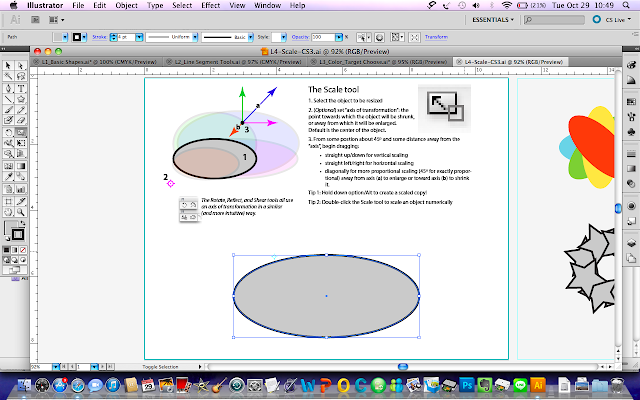
Scale Tools is for making the shape bigger, smaller, taller, shorter, and friends. First, you have to choose the object, then click the scale tools on the left side. After that just play with the pointer, you can slide and hold it to the left and right or up and down. Then you can found it how to make the shape looks what you want. 
You can also change the axis of the object. Just click where you want to put the axis. For example mine (the second image), i put it there and when you start using scale , it will following the axis.


It also applied in Rotate Tool. Look! My object is following the axis.

L5: Warp
You can find the Warp Tool on the left side. And there are choices of warp tool that you can use. You can make it like this:
Tried your own wrap tool ;-)

For the homework, sir Em asked us to do L7-L12. It's about using the Pen Tool that you can find on the left side. This is what I've done:

L7: Pen Closed Shape
You just have to follow the arrow and the steps. The result will be like the orange line that sir Em have made.

L8: Pen Corners

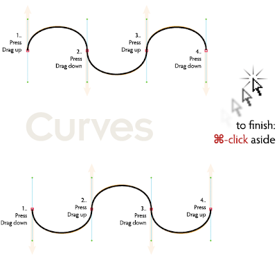
L9: Pen Curves

L10: Pen Overview


L11: Pen Straight


 L12: Tracing
Haha see, I need more exercises ;)

Wednesday, 23 October 2013

Brief History of Typography, Printing, and Photography

Tuesday, October 22nd 2013

Today was our first day in contextual class. Its all about history of graphic design. Everything in graphic design has their history. 

Graphic design visual communicatin has 6 important things such as typography, design thinking, drawing or illustration, layouts, DI, and presentation. Those things has their own history.

Lets begin on typography first.

On Paleolithic era, people's ability on communication was found on the cave (the first one were from north america and french)
the first proof about people's ability on communicate was found on the cave. the background why they made cave paintings because they just want to tell and gave information.
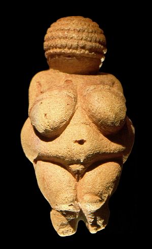
Venus vu Willendorf is trusted as the oldest sculpture

After that on Mesopotamian era, people made a symbol. Its for counting for example how many lamb that Adam had? Like that.

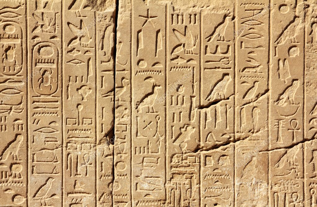
On Egypt era, people use some symbol to communicate with God. It called Hieroglyphs.

Hieroglyphs are written in rows or columns and can be read from left to right or from right to left. You can distinguish the direction in which the text is to be read because the human or animal figures always face towards the beginning of the line. Also the upper symbols are read before the lower.

Some people said that each letter was based on the sound. For example A from the bird sound maybe like "A.. A.." hehehe

After that it comes from Asia, the oldest asian alphabet comes from China. It was found on the stone. This is the development of chinese alphabets:


Greek alphabet
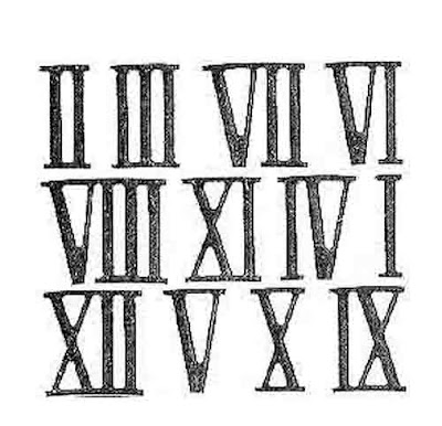
The modern alphabet comes from roman alphabet. They also used grid so it looks neat.

the dark green one uses roman alphabet, the bright green one 50:50, and the grey one uses another alphabet.


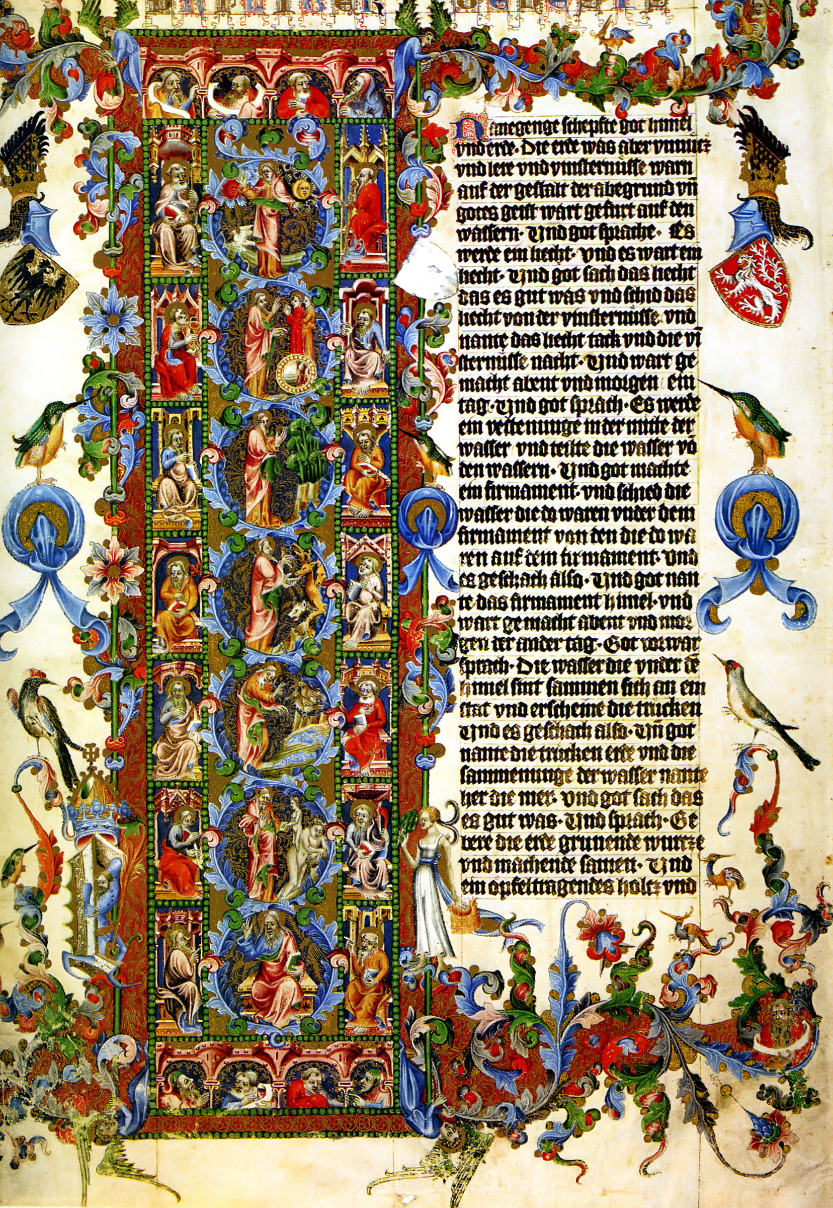
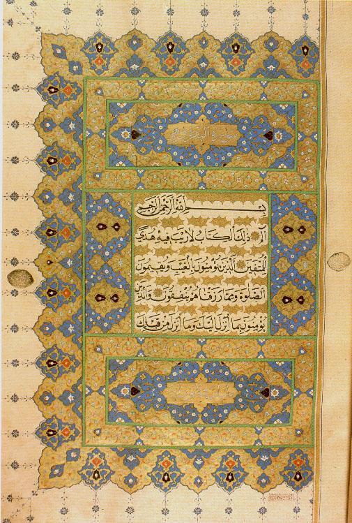
illuminated manuscript:

url.jpg


url.jpg


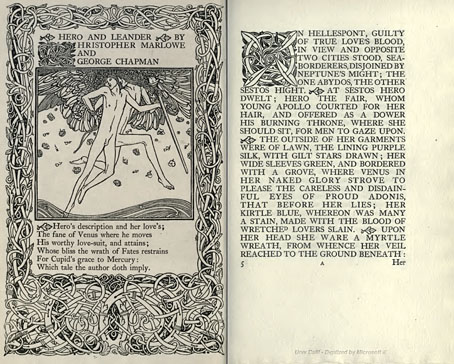
On this era, books and everything has ornaments. The first letter of a story was bigger and decorated.

Each printer has different colour. For example the first one is blue then red and so on.

Photography
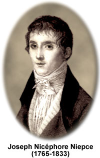
The first photograph by Joseph Niepce


Printing


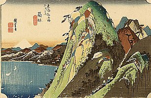
  • Ukiyo-e means "pictures of the floating world" and defines an art movement of japan's tokugawa period (1603-1867)
  • Ukiyo-e blended the realistic naratives of Emaki (traditional picture scrolls) with influences from decorative design arts.
  • The earliest ukiyo-e works were screen paintings depicting the entertainment district


Most of Ukiyo-e are about women, beauty, flower, bird, having fun, and entertainment district.  Why bird? Because bird represents freedom and freedom is beautiful.
Japanese woodblock prints were a careful collaboration between publisher, artist, block-cutter, and printer. Here are some figures of ukiyo-e:


1. Hishikawa Moronobu
is widely respected as the first master of ukiyo-e print. Moronobu became a book illustrator who used chinese woodcut techniques and reach large number of audiences
He was called as father of comic
2. Okumura Masanobu
was one of the first fine artist that use 2 colours printing

3. Kitagawa Utamaro
he was called the supreme poet of Japanese print, most of his work was based on beauty (women, flower, birds)

4. Katsushika Hokusai
most renowned ukiyo-e artist, produce 35.000 works.

5. Ando Hiroshige
sas last great master of the japanese woodiest great rival of hokusai

Art Nouveau:

Background
  • Art nouveau was an international decorative style that thrived during the 2 decades (1890-1910)
  • works includes design art such as architecture, furniture, product design, fashion, posters, packages, advertisements
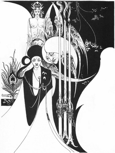
  • it that based on organic, plant-like lines, women, birds (peacock)
  • art nouveau is the transitional style that evolved from the historicism that dominated design for most of 19th century. Art nouveau became the initial phase of the modern movement
  • Modern architecture, graphic, and industrial design, surrealism, and abstract art have roots in art nouveau's theory and concept
A.N. Fashion and architecture
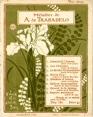
Art Nouveau for Graphic Design
  • A.N. (Art Nouveau) as a eceryday job for graphic designer and illustrator
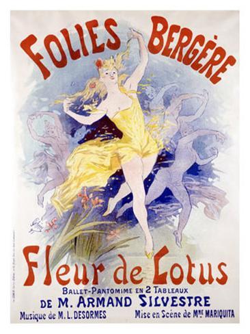
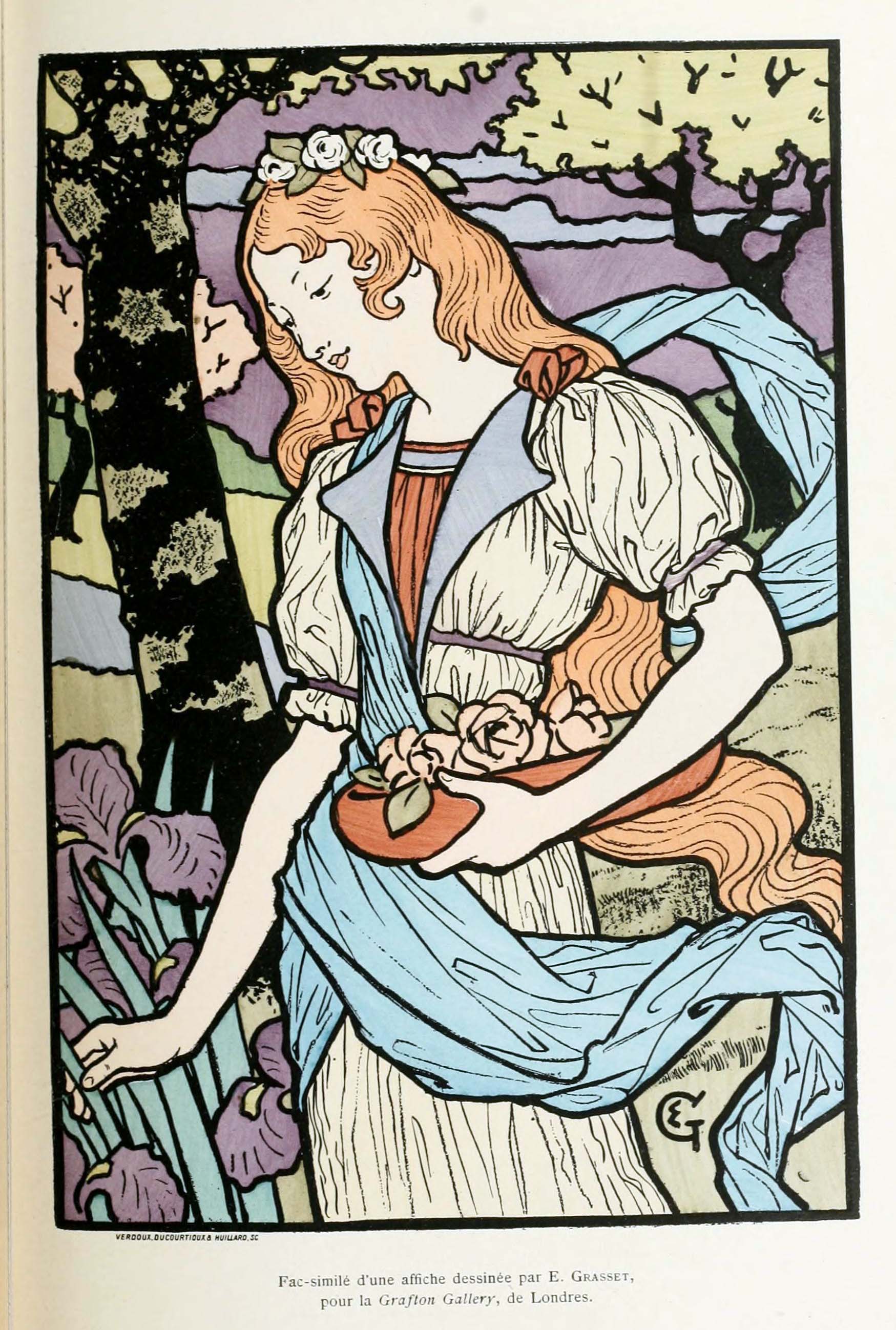
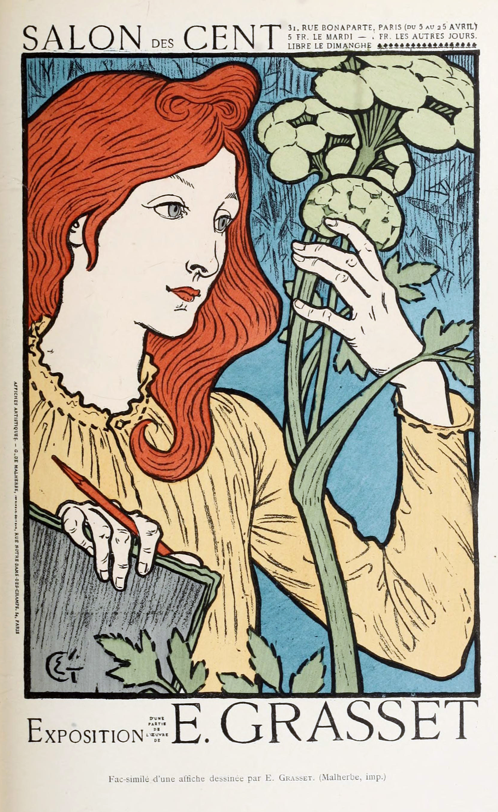
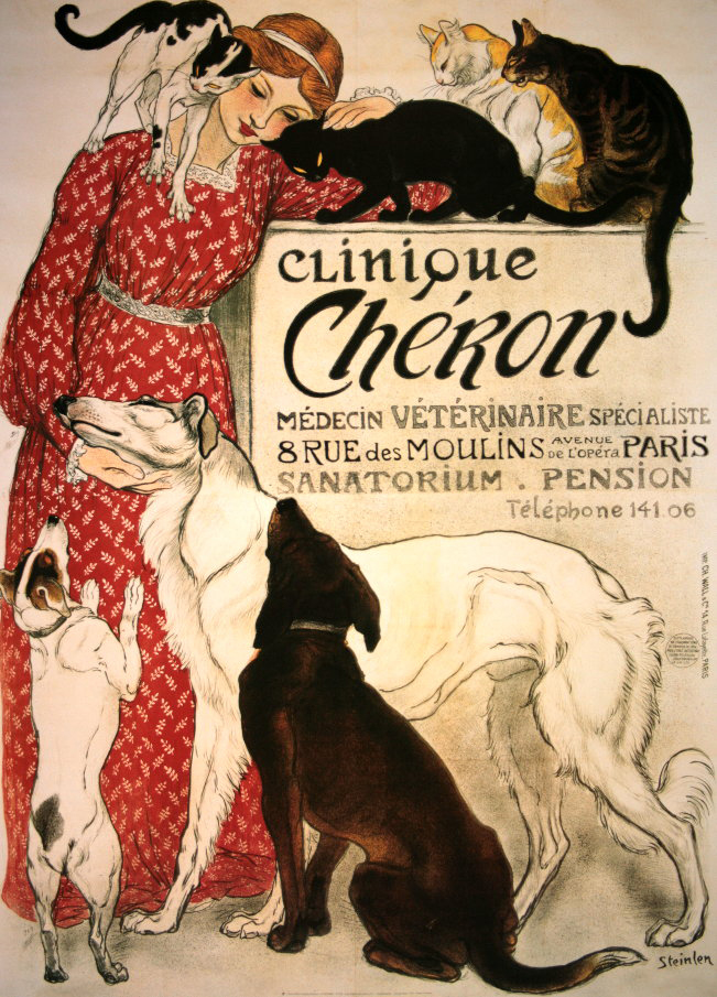
  • Transition from victoriaan graphics to a.n. was gradual one, artist like Jules Cheret (1836-1933){father of the modern poster} and Eugene Grasset (1841-1917){graphic design}, played important role in the transition of art movement.

1. Jules Cheret
Moulin rouge is the famous one.
Jules Cheret

2. Eugene Grasset


He used possitive and negative


For the homework, i tried to make my 1st week artwork:
I made the sketch with pencil first.

Then, I use a marker for the outline

I started to colour it with coloured pencil

Then i continued making the hieroglyphs. Guess what's the meaning of mine ;-P